A Guide to Challenge Coin Finishes: Nickel, Gold, Antique Silver and More
Explore popular challenge coin finishes including nickel, gold, antique silver, black nickel, bronze and copper, and how each changes the final design.


The finish of a challenge coin can completely change its character. The same artwork can feel contemporary in bright nickel, historic in antique silver or ceremonial in gold. Choosing a finish is therefore more than a technical production decision. It is part of the design.
Nickel
Nickel gives a bright silver-coloured appearance that works particularly well with strong enamel colours. It can feel: clean, modern, crisp and professional.
Black, navy, red, white and green enamel can all contrast strongly with nickel. It is a versatile choice for designs that need clearly defined raised metal and lettering.
Gold
A polished gold-style finish creates a warmer and often more ceremonial appearance. It can suit: long-service recognition, awards, anniversaries and formal presentation pieces.
Gold is visually strong, so restraint is useful. Deep blue, black, burgundy and white can work particularly well because they allow the metal to remain part of the design rather than competing with too many bright colours.
Antique silver
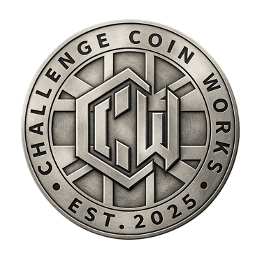
Antique silver produces a different effect. Darker recessed areas contrast with higher metal surfaces, which can make sculpted and textured detail more visible. That makes it particularly effective for 3D work.
It can lend itself to commemorative, heritage and service-related designs where a slightly more traditional character is appropriate.
Antique gold
Antique gold combines warmth with the contrast created by darker recessed areas. It can feel more established and less reflective than polished gold. Used with a restrained colour palette, it can work well for formal recognition, anniversaries and detailed designs.
Black nickel
Black nickel creates a much darker and more contemporary appearance. It can look striking when combined with bright enamel. Because the surrounding metal is dark, however, colour contrast becomes especially important. Dark enamel against black nickel can disappear visually if the design is not handled carefully.
Bronze and copper-style finishes
Copper and bronze tones bring warmth and character. They can work well for: heritage themes, clubs, commemorative projects, fundraising pieces and designs connected to history or place. They can feel less formal than bright silver or gold, depending on the artwork.
Finish and relief should work together
The plating should not be chosen in isolation. A crisp 2D design with strong enamel may look excellent in bright nickel. A sculpted 3D design may benefit from an antique treatment that emphasises its contours. The colour palette, texture and finish should support one another.
Presentation matters too
Consider how the finished coin will be seen. A silver-toned coin can stand out beautifully against a dark presentation insert. Gold may create a warmer formal presentation. Antique finishes can photograph particularly well when directional light catches the relief. The coin and its presentation should feel like part of the same decision.
There is no universal “best” finish.
The best choice is the one that supports the purpose of the coin and makes the design work when it is actually held in the hand.
Planning a custom coin project? Send us your idea, sketch or artwork and we’ll help you explore the right design, finish, quantity and presentation options.
Challenge Coin Works | Serving those who serve us.
Contact
© 2025-2026 Challenge Coin Works. All rights reserved.
Resources from Flaticon.com
Legal
Quick links

